
The Good stf
SELF SPACE MODALITIES
SELF SPACE MODALITIES
SCOPE
SCOPE
Self Space came to us needing a way to visualise something that isn't a tangible thing, their full range of therapy modalities. There was no established visual system for it, and no obvious way to represent something as personal and abstract as a therapeutic approach.
We developed a series of collage based illustrations, one for each modality, moving away from the cliche stock photography and obvious metaphors typical of the industry that can sometimes feel soft edged and disconnected from the raw difficulties of real life.
Self Space came to us needing a way to visualise something that isn't a tangible thing, their full range of therapy modalities. There was no established visual system for it, and no obvious way to represent something as personal and abstract as a therapeutic approach.
We developed a series of collage based illustrations, one for each modality, moving away from the cliche stock photography and obvious metaphors typical of the industry that can sometimes feel soft edged and disconnected from the raw difficulties of real life.
SERVICES
SERVICES
Creative Direction
Illustration
Production Roll Out
Printed Booklet
Web Assets
Creative Direction
Illustration
Production Roll Out
Printed Booklet
Web Assets

PROBLEM
PROBLEM
Therapy modalities are ideas and experiences rather than physical things, often difficult to put into words, let alone images. Self Space needed the work to hold real nuance, communicating complex and sometimes difficult subjects without feeling clinical or oversimplified.
The identity also needed to feel human and approachable, in keeping with how Self Space talks about therapy, while still respecting how personal each modality actually is to the people engaging with it.
Therapy modalities are ideas and experiences rather than physical things, often difficult to put into words, let alone images. Self Space needed the work to hold real nuance, communicating complex and sometimes difficult subjects without feeling clinical or oversimplified.
The identity also needed to feel human and approachable, in keeping with how Self Space talks about therapy, while still respecting how personal each modality actually is to the people engaging with it.
SERVICES
SERVICES
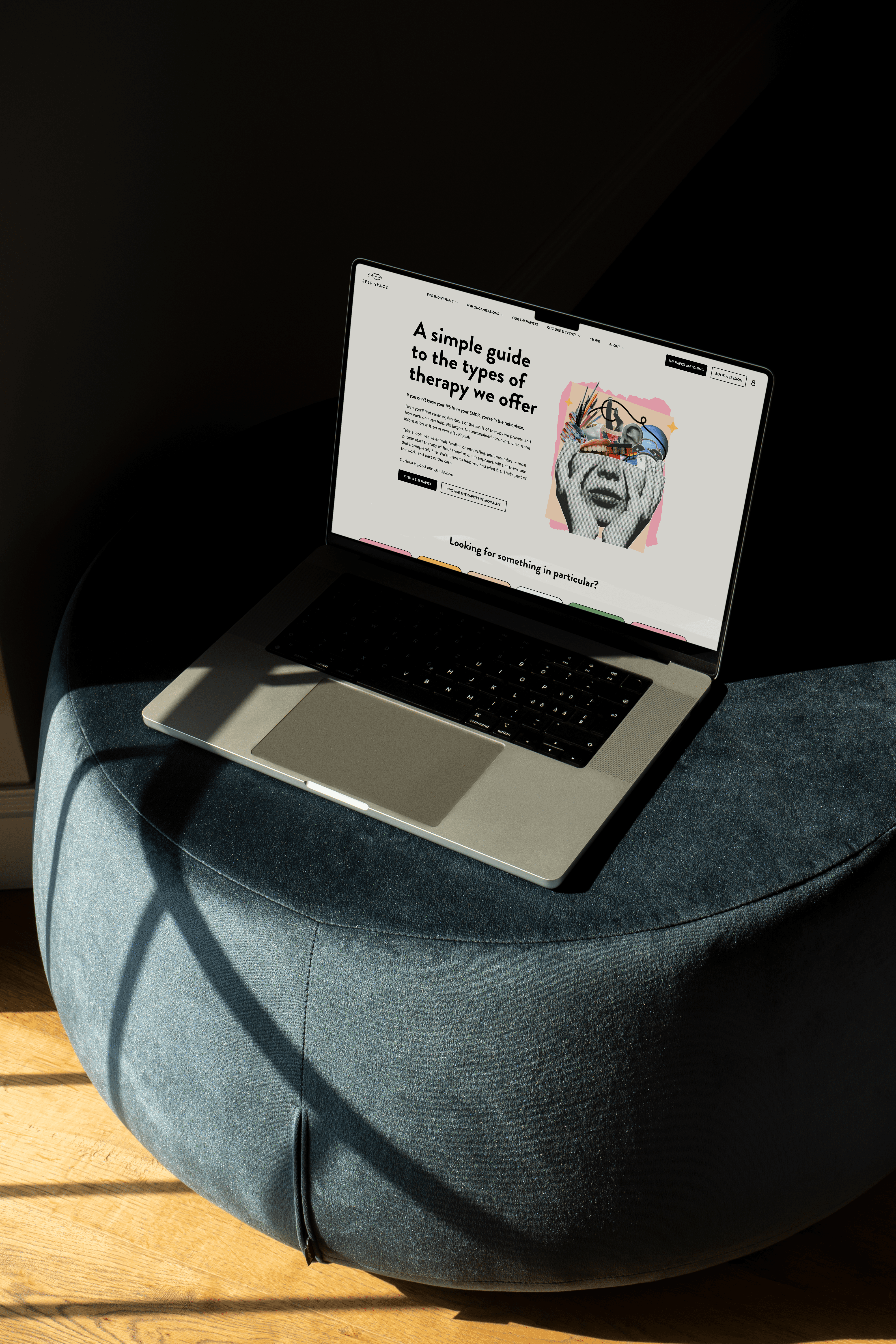
We developed a set of collage based illustrations, one for each therapy modality, combining familiar objects with drawing and colour to build a distinct visual world for the collection. Each piece was built around a central concept, from a Rubik's cube used to explore the complexity of Intercultural Therapy through to a marbled, shifting figure for Somatic Experiencing, translating the feeling of each approach into something visual.
The illustrations were then woven into the wider Self Space brand, becoming part of the marketing and communications used across the website and beyond.
We developed a set of collage based illustrations, one for each therapy modality, combining familiar objects with drawing and colour to build a distinct visual world for the collection. Each piece was built around a central concept, from a Rubik's cube used to explore the complexity of Intercultural Therapy through to a marbled, shifting figure for Somatic Experiencing, translating the feeling of each approach into something visual.
The illustrations were then woven into the wider Self Space brand, becoming part of the marketing and communications used across the website and beyond.
OUTCOME
OUTCOME
The visual style reflected the abstract language of therapy so well that the response went beyond expectations, and the decision was made to roll the modalities identity and collage style out across the wider brand. What started as illustrations for one page on the site has become the defining visual language for Self Space as a whole.
The feedback has been consistently strong, with the design resonating across the business and with the wider audience engaging with the brand day to day. A small, focused project has grown into the identity shaping everything Self Space creates, and continues to set the direction for the brand going forward.
The visual style reflected the abstract language of therapy so well that the response went beyond expectations, and the decision was made to roll the modalities identity and collage style out across the wider brand. What started as illustrations for one page on the site has become the defining visual language for Self Space as a whole.
The feedback has been consistently strong, with the design resonating across the business and with the wider audience engaging with the brand day to day. A small, focused project has grown into the identity shaping everything Self Space creates, and continues to set the direction for the brand going forward.

(01) PRINT BOOKLET
(01) PRINT BOOKLET
(02) Web assets
(02) Web assets

EXISTENTIAL THERAPY

Dialectical Behaviour Therapy

Intercultural THERAPY

Somatic Experiencing

Integrative THERAPY

Art & Creative THERAPY

EMDR

Gestalt THERAPY

Mindfulness-Based Cognitive THERAPY (CBT)

Psychodynamic THERAPY

Transactional Analysis THERAPY

Internal Family Systems THERAPY

Humanistic THERAPY

PERSON CENTRED THERAPY

Family Therapy

Acceptance & Commitment THERAPY

COUPLES THERAPY

Cognitive Behavioural Therapy
(03) THE FULL COLLAGE SET
(03) THE FULL COLLAGE SET
(04) PRINT BOOKLET
(04) PRINT BOOKLET
Projects
CASE STUDIES
CASE STUDIES


WORK
STUDIO
ART&COMMUNITY
START A PROJECT

WORK
STUDIO
ART&COMMUNITY
START A PROJECT
WORK
STUDIO
ART&
COMMUNITY
START A PROJECT
WORK
STUDIO
ART&
COMMUNITY
START A PROJECT