
The Good stf
ENDURE
ENDURE
SCOPE
SCOPE
Endure came to us as a lifestyle wellbeing brand built around holistic movement, with a mission to eliminate self doubt in people chasing their wellness goals. The challenge was to build a brand world that could hold a community experience across app, in person events and retreats, while feeling elevated enough to stand apart from the wider fitness and wellness space.
We developed the identity from first principles, creating a flexible system that could flex across everything from social and merch to run clubs, retreats and a growing digital community hub.
Endure came to us as a lifestyle wellbeing brand built around holistic movement, with a mission to eliminate self doubt in people chasing their wellness goals. The challenge was to build a brand world that could hold a community experience across app, in person events and retreats, while feeling elevated enough to stand apart from the wider fitness and wellness space.
We developed the identity from first principles, creating a flexible system that could flex across everything from social and merch to run clubs, retreats and a growing digital community hub.
SERVICES
SERVICES
Brand Strategy
Visual Identity
Website Design
Email Templating
Brand Merchandise
Brand Strategy
Visual Identity
Website Design
Email Templating
Brand Merchandise

PROBLEM
PROBLEM
The biggest challenge of Endures audience is self doubt, the feeling that makes change seem impossible for people who don't feel like the fitness and wellness world was built for them. The identity needed to speak directly to that audience truth, communicating strength and tenacity without losing the warmth, community and optimism the brand promises.
At the same time, Endure needed to feel soulful, gritty and optimistic all at once, badass enough to inspire belief yet gentle enough to never push anyone away.
The biggest challenge of Endures audience is self doubt, the feeling that makes change seem impossible for people who don't feel like the fitness and wellness world was built for them. The identity needed to speak directly to that audience truth, communicating strength and tenacity without losing the warmth, community and optimism the brand promises.
At the same time, Endure needed to feel soulful, gritty and optimistic all at once, badass enough to inspire belief yet gentle enough to never push anyone away.
SERVICES
SERVICES
We developed the Endure brand identity, starting with the strategic foundation, defining the brand purpose to inspire metamorphosis in those who don't believe it's possible, and shaping the position around motivational community, actionable wellness tools and a dash of magic. This positioning informed every part of the visual identity, from the primary logo and emblem through to colour, typography and illustration.
We then translated this into a full set of brand guidelines, alongside the digital and physical applications needed to bring the identity to life, from merch and social to retreat materials and the app.
We developed the Endure brand identity, starting with the strategic foundation, defining the brand purpose to inspire metamorphosis in those who don't believe it's possible, and shaping the position around motivational community, actionable wellness tools and a dash of magic. This positioning informed every part of the visual identity, from the primary logo and emblem through to colour, typography and illustration.
We then translated this into a full set of brand guidelines, alongside the digital and physical applications needed to bring the identity to life, from merch and social to retreat materials and the app.
OUTCOME
OUTCOME
The result is a brand that pushes Endure beyond the expected visual language of the wellness industry, giving it genuine presence across community, retreats and merch. The identity balances a bold, earthy colour palette with soft curved edges and elevated typography, capturing a brand that is gritty, soulful and optimistic in equal measure.
Endure now has a brand system that feels established and recognisable, with the flexibility to move from calm, considered editorial content into bold, energetic campaign work as the community continues to grow.
The result is a brand that pushes Endure beyond the expected visual language of the wellness industry, giving it genuine presence across community, retreats and merch. The identity balances a bold, earthy colour palette with soft curved edges and elevated typography, capturing a brand that is gritty, soulful and optimistic in equal measure.
Endure now has a brand system that feels established and recognisable, with the flexibility to move from calm, considered editorial content into bold, energetic campaign work as the community continues to grow.

(01) LOGO STAMP
(01) LOGO STAMP

(02) BRAND MOCKUP
(02) BRAND MOCKUP

(03) PRIMARY LOGO
(03) PRIMARY LOGO

(04) BRANDMARK

(05) SECONDARY LOGO
(05) SECONDARY LOGO

(06) ICON SUITE
(06) ICON SUITE

(07) MARKETING MATERIALS
(07) MARKETING MATERIALS

(08) FLY POSTERING
(08) FLY POSTERING

(09) SOCIAL MEDIA
(09) SOCIAL MEDIA

(10) MERCHANDISE
(10) MERCHANDISE
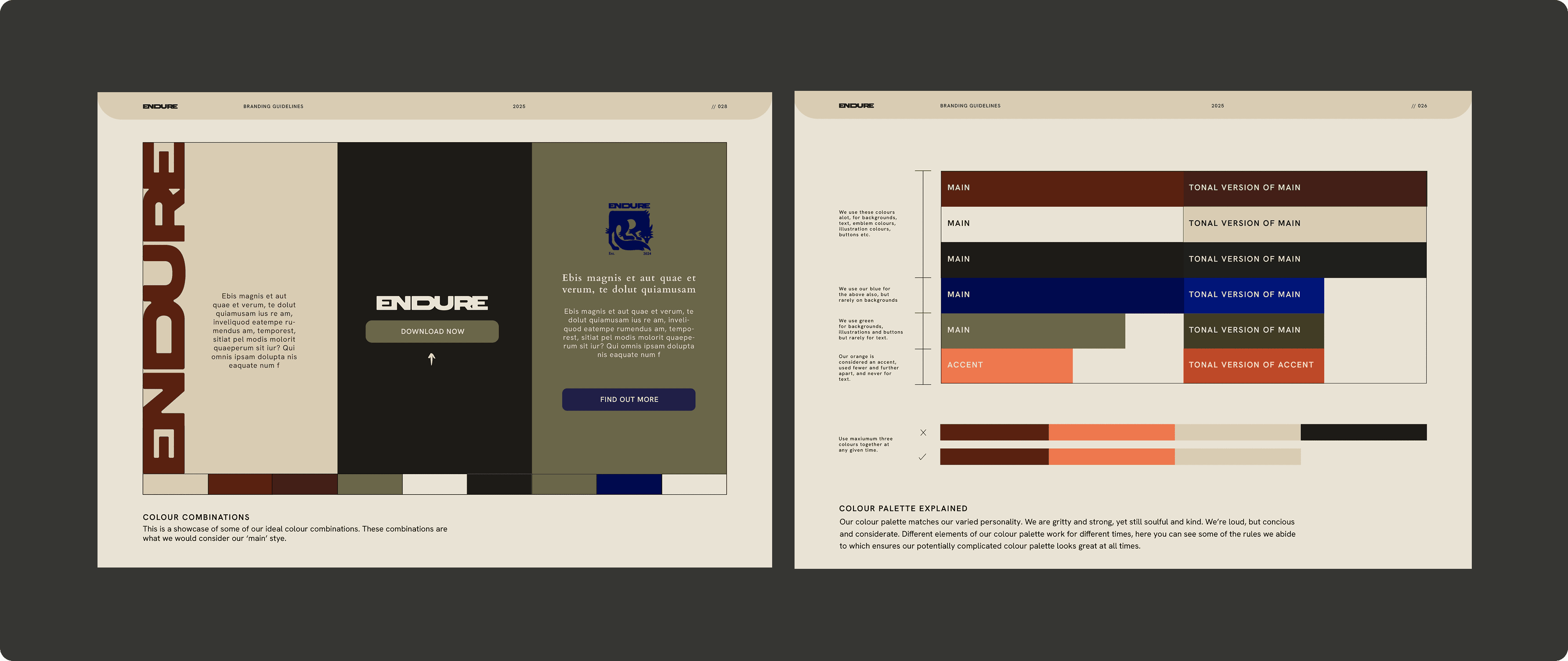
(11) BRANDING GUIDELINES
(11) BRANDING GUIDELINES
Projects
CASE STUDIES
CASE STUDIES


WORK
STUDIO
ART&COMMUNITY
START A PROJECT

WORK
STUDIO
ART&COMMUNITY
START A PROJECT
WORK
STUDIO
ART&
COMMUNITY
START A PROJECT
WORK
STUDIO
ART&
COMMUNITY
START A PROJECT